The use of colours in web design and branding is a crucial aspect of creating a successful and effective website or brand. Colours have the power to evoke certain emotions and feelings, and can greatly influence the way people perceive a brand or website. Understanding the psychology of colours and how they affect people is therefore essential when designing a website or creating a brand.
Colour psychology is the study of how colours affect human behaviour and emotions. Different colours can evoke different emotions and feelings, and can even influence people’s decision-making processes. For example, red is often associated with passion and excitement, while blue is associated with calmness and trustworthiness. By understanding the psychology of colours, web designers and brand creators can use colour to their advantage to create a specific emotional response in their audience.
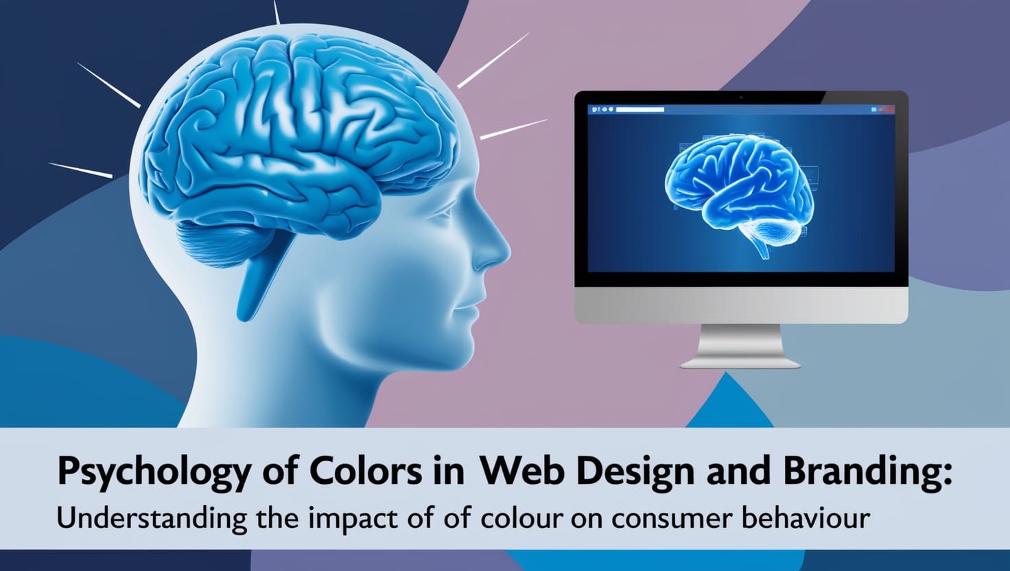
Understanding the Psychology of Colours
Colours play a vital role in web design and branding. Understanding the psychology of colours is important for designers and marketers to create an effective brand identity and website that resonates with their target audience.
Colour Psychology
Colour psychology is the study of how colours affect human behaviour and emotions. Different colours evoke different emotions and can influence the perception of a brand. For example, blue is often associated with trust and reliability, while red is associated with passion and excitement.
Emotions
Colours have the power to evoke emotions. They can make people feel happy, calm, or even angry. In web design and branding, it’s important to choose colours that evoke the right emotions for the brand. For example, a health and wellness brand might use green to evoke feelings of calmness and relaxation.
Perception
Colours can also influence the perception of a brand. The right colour can make a brand appear more professional, trustworthy, and authoritative. On the other hand, the wrong colour can make a brand appear unprofessional and untrustworthy.
Culture
Colours can have different meanings in different cultures. For example, in Western cultures, white is often associated with purity and innocence, while in some Eastern cultures, it’s associated with death and mourning. It’s important for designers and marketers to consider the cultural significance of colours when creating a brand identity or website.
Psychology of Color
The psychology of colour is a complex topic that involves the study of colour perception, colour symbolism, and colour preferences. Designers and marketers should have a basic understanding of the psychology of colour to create an effective brand identity and website.
Behaviours
Colours can also influence behaviour. For example, a call-to-action button in red might be more effective at getting clicks than a button in blue. Colours can also influence purchasing behaviour. Marketers often use colour to create a sense of urgency or to make a product more appealing.
In conclusion, understanding the psychology of colours is crucial for designers and marketers to create an effective brand identity and website. Colours have the power to evoke emotions, influence perception, and even change behaviour. By choosing the right colours, designers and marketers can create a brand that resonates with their target audience and achieves their marketing goals.
Build Your Website Now
Open your business up to online opportunity. Develop an online presence and grow your brand.
Colours play a crucial role in web design and branding. They have the power to influence user behaviour, evoke emotions, and create a unique aesthetic that sets a website apart from its competitors. In this section, we will explore the different aspects of colour in web design and how they can be used to create an effective website.
Colour Selection for Websites
Choosing the right colour palette for a website is an important decision that should be made carefully. The colours used should reflect the brand’s values and target audience. It is important to consider the gender, culture, and values of the target audience when selecting colours. For example, pink is often associated with femininity, while blue is seen as a more masculine colour.
Colour Associations in Web Design
Colours have specific associations that can be used to influence user behaviour. For example, red is often associated with passion, excitement, and urgency, while blue is seen as calming, trustworthy, and professional. These associations can be used strategically to create a specific mood or feeling on a website.
Influencing User Behaviour with Colours
Colours can be used to influence user behaviour and decision-making on a website. For example, using a red call-to-action button can create a sense of urgency and encourage users to take action. On the other hand, using a blue button can create a sense of trust and encourage users to make a purchase.
Website Branding with Colours
Colour is an important part of website branding. Using consistent colours throughout a website can increase brand recognition and create a strong visual identity. It is important to choose colours that reflect the brand’s values and are memorable to the target audience. Coca-Cola and IBM are examples of companies that have successfully used colour to create a strong brand identity.
Colour and User Experience
Colour can have a significant impact on user experience. Using colours that are comfortable to the eyes can create a positive experience for users and encourage them to stay on the website longer. On the other hand, using colours that are too bright or too dark can create frustration and discourage users from interacting with the website.
Case Studies: Colour in Web Design
There are many examples of websites that have successfully used colour to create a unique and effective design. For example, the website for Airbnb uses a vibrant colour palette that reflects the brand’s values of creativity and adventure. The website for Dropbox, on the other hand, uses a more muted colour palette that reflects the brand’s values of simplicity and professionalism.
In conclusion, colour is a powerful tool in web design and branding. By carefully selecting colours that reflect the brand’s values and target audience, and using them strategically to influence user behaviour and create a positive user experience, websites can create a strong visual identity and stand out in a crowded online marketplace.
Colour Psychology in Branding
Colour psychology is the study of how colours affect human behaviour and emotions. It has been a significant factor in branding and marketing for years. Choosing the right colours for a brand can have a significant impact on how the brand is perceived by its target audience. In this section, we will explore the different aspects of colour psychology in branding.
Choosing Colours for a Brand
When choosing colours for a brand, it is essential to consider the target audience and the industry. Different industries have different colour schemes that are associated with them. For example, the healthcare industry often uses blue and green, while the food industry uses red and yellow. It is also crucial to consider the emotional response that colours evoke. For instance, blue is often associated with trust and reliability, while red is associated with excitement and passion.
Colour and Brand Perception
Colour can influence how a brand is perceived by its audience. The colours used in a logo, website, or marketing materials can evoke different emotions and associations. For example, a brand that uses blue is often perceived as trustworthy and reliable, while a brand that uses red is often associated with excitement and passion.
Influencing Consumer Decisions with Colour
Colour can influence consumer decisions. Studies have shown that people make purchasing decisions within 90 seconds of interacting with a product, and up to 90% of that decision is based on colour. Colours can evoke emotions and influence consumer behaviour. For example, yellow is often associated with impulse buying, while green is associated with eco-friendliness and sustainability.
Colour and Brand Values
The colours used in a brand can also communicate the brand’s values. For example, a brand that uses green can be associated with sustainability and environmentalism. A brand that uses blue can be associated with trust and reliability. The colours used in a brand can help communicate the brand’s values to its audience.
Case Studies: Colour in Branding
Coca-Cola and IBM are two examples of brands that have successfully used colour in their branding. Coca-Cola uses red in its logo and marketing materials, which is associated with excitement and passion. IBM uses blue in its logo and marketing materials, which is associated with trust and reliability.
In conclusion, colour psychology is an essential factor in branding and marketing. Choosing the right colours for a brand can have a significant impact on how the brand is perceived by its target audience. By understanding the emotional response that colours evoke, brands can select colours that communicate their values and influence consumer behaviour.
Build Your Website Now
Open your business up to online opportunity. Develop an online presence and grow your brand.
The use of colours in web design and branding is not just a matter of aesthetics, but it also has a significant impact on the emotions of the audience. Different colours evoke different emotions and associations, and it is crucial to understand the psychology of colours to create an effective and meaningful visual identity.
Red: Passion and Urgency
Red is a powerful and attention-grabbing colour that symbolizes passion, urgency, and excitement. It is often used in branding to create a sense of urgency and to stimulate appetite. However, it can also convey danger, anger, and aggression, so it should be used with caution.
Blue: Trust and Stability
Blue is a calming and trustworthy colour that is often associated with stability, confidence, and loyalty. It is a popular choice for corporate branding, as it conveys professionalism and reliability. However, it can also be perceived as cold and unemotional, so it is important to balance it with warmer colours.
Green: Nature and Wealth
Green is a versatile colour that can evoke a sense of nature, growth, and balance. It is often used in branding related to health and wellness, as well as financial services and eco-friendly products. It can also be associated with wealth and prosperity, making it a popular choice for luxury brands.
Yellow: Optimism and Energy
Yellow is a bright and cheerful colour that symbolizes optimism, energy, and happiness. It is often used in branding related to food and beverages, as well as children’s products and entertainment. However, it can also be perceived as immature and cheap, so it should be used sparingly and in combination with other colours.
Purple: Royalty and Spirituality
Purple is a rich and luxurious colour that is often associated with royalty, spirituality, and creativity. It is a popular choice for high-end brands and products, as well as artistic and cultural institutions. However, it can also be perceived as pretentious and elitist, so it should be used with care.
Black and White: Elegance and Simplicity
Black and white are classic and timeless colours that convey elegance, sophistication, and simplicity. They are often used in branding related to fashion, beauty, and luxury products. However, they can also be perceived as cold and sterile, so it is important to balance them with warmer colours and textures.
Other Colours and Their Meanings
Other colours such as orange, pink, brown, and grey also have their own unique meanings and associations. Orange is often associated with excitement and creativity, while pink is linked to romance and friendliness. Brown can convey earthiness and warmth, while grey is often used to convey neutrality and professionalism.
Understanding the emotional impact of colours is essential for creating effective and meaningful branding and web design. By choosing the right colours and combinations, brands can create a visual identity that resonates with their target audience and conveys their values and personality.
Build Your Website Now
Open your business up to online opportunity. Develop an online presence and grow your brand.
Colour perception can vary across different cultures. For example, in Western cultures, the colour white is often associated with purity and innocence, while in some Eastern cultures, it is associated with mourning and death. Similarly, the colour red is often associated with love and passion in Western cultures, but in some Eastern cultures, it is associated with luck and prosperity.
Cultural differences in colour perception can also affect branding and website design. A study on colour appeal in website design within and across cultures found that cultural relativism suggests that colour perception is influenced by cultural norms and values. Therefore, it is important for companies to consider cultural differences in colour perception when designing their websites and branding.
The study also found that different colours can have different meanings and associations across cultures. For example, the colour green is associated with nature and the environment in Western cultures, but in Islamic cultures, it is associated with paradise. Similarly, the colour blue is often associated with calmness and serenity in Western cultures, but in Hindu cultures, it is associated with Lord Krishna.
To avoid branding effects, companies should consider the appropriateness of colours for their target audience. For instance, the colour red may be appropriate for a website targeting a Chinese audience, as it is associated with good luck and prosperity in Chinese culture. However, it may not be appropriate for a website targeting a Western audience, as it is associated with danger and warning in Western cultures.
In conclusion, cultural differences in colour perception can have a significant impact on branding and website design. Companies should consider cultural norms and values when selecting colours for their branding and websites, and ensure that the colours are appropriate for their target audience.
The Science Behind Colour Choices
Colour is a powerful tool that can evoke emotions and influence behaviour. In web design and branding, colour choices are crucial as they can affect how users perceive a brand and interact with a website. Therefore, understanding the science behind colour choices is essential for designers and marketers.
Colour theory is the foundation of the science behind colour choices. It is a set of principles used to create harmonious colour combinations and convey specific messages. The theory is based on the colour wheel, which consists of primary, secondary, and tertiary colours. Designers use colour theory to choose hues that complement each other and create a balanced design.
When it comes to web design and branding, colour choices are not just about aesthetics. They are also about conveying a message and creating a brand identity. Different colours can evoke different emotions and associations. For example, blue is often associated with trust and professionalism, while red is associated with excitement and passion. Therefore, designers and marketers need to consider the psychological effects of colours when making colour choices.
One way to understand the psychological effects of colours is to look at cultural associations. Different cultures have different meanings and associations with colours. For example, in Western cultures, white is associated with purity and innocence, while in Eastern cultures, it is associated with death and mourning. Therefore, designers and marketers need to consider cultural associations when making colour choices for a global audience.
In summary, the science behind colour choices is based on colour theory and the psychological effects of colours. By understanding these principles, designers and marketers can create effective and impactful designs that convey the desired message and create a strong brand identity.
Conclusion
In conclusion, the psychology of colours in web design and branding is a complex field that requires careful consideration and planning. The use of colours can have a significant impact on the user’s emotions, perception, and behaviour.
The research indicates that colours can influence the way users perceive a brand and its message. For example, blue is often associated with trust, reliability, and professionalism, while red is associated with excitement, passion, and urgency. It is essential to choose colours that align with the brand’s values and message to create a strong brand identity.
Moreover, the research suggests that the use of colours should be consistent across all platforms, including websites, social media, and print materials. Consistency helps reinforce the brand’s message and creates a sense of familiarity with the users.
Looking towards the future, the psychology of colours in web design and branding will continue to evolve. As technology advances, new colour trends and combinations will emerge, and designers will need to stay up to date with these changes.
In light of these findings, it is recommended that businesses and designers take a strategic approach to the use of colours in web design and branding. This includes understanding the target audience, the brand’s message, and the desired emotional response. By doing so, businesses can create a strong brand identity that resonates with their audience and drives success.