Choosing the right font for a website is a crucial aspect of web design. It is an essential element that can make or break the overall user experience. The right font can help to convey the brand message and enhance the readability of the content. On the other hand, the wrong font can make the website look unprofessional and difficult to read.
Typography is the art and technique of arranging type to make written language legible, readable, and appealing when displayed. It involves the selection of typefaces, point sizes, line lengths, line-spacing, and letter-spacing, among other things. Typography plays a significant role in web design, and it is essential to choose the right fonts that are both aesthetically pleasing and functional. A typography guide can help web designers to choose the right fonts for their websites, taking into account factors such as legibility, readability, and brand identity.
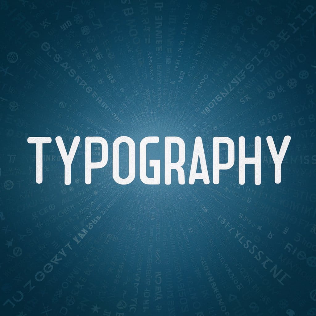
Understanding Typography
Typography is the art and technique of arranging type to make written language legible, readable, and appealing when displayed. It involves choosing typefaces, point sizes, line lengths, line-spacing, and letter-spacing, and adjusting the space between pairs of letters. Typography is an essential part of web design, and it plays a crucial role in how users perceive and interact with your website.
The typeface is the design of the letterforms that make up a font. There are two main categories of typefaces: serif and sans-serif. Serif typefaces have small lines or flourishes at the ends of the strokes that make up the letters, while sans-serif typefaces do not have these lines. Serif typefaces are considered more traditional and formal, while sans-serif typefaces are seen as more modern and casual.
Choosing the right typeface for your website is critical because it can affect the readability, mood, and overall aesthetic of your site. Serif typefaces are often used for body text in print because they are easier to read in long blocks of text. On the other hand, sans-serif typefaces are commonly used for digital content because they are more legible on screens and have a cleaner, more modern look.
When selecting a font for your website, it is important to consider its legibility, style, and compatibility with your brand. Legibility refers to how easily the text can be read, while style refers to the overall look and feel of the font. Compatibility with your brand means that the font should reflect the personality and values of your brand.
In conclusion, understanding typography is crucial to creating a visually appealing and readable website. By choosing the right typeface, you can enhance the user experience and effectively communicate your brand’s message.
Get Your Website
Transform your website into a captivating portal that not only draws in visitors but turns them into loyal customers. With our bespoke web design services, we focus on creating stunning, user-friendly websites tailored to your unique business needs. Don’t let your online presence be an afterthought
When it comes to designing a website, readability is of utmost importance. Readability refers to the ease with which a reader can comprehend the text on a page. It is essential to choose the right font, font size, line spacing, leading, kerning, and x-height to ensure that the text is easy to read.
Legibility is another important factor that affects readability. Legibility refers to the ease with which individual letters can be distinguished from one another. Choosing a font that is legible is crucial for ensuring that the text is easy to read.
User experience is also impacted by readability. If the text on a website is hard to read, users are likely to leave the site quickly. By choosing the right font, font size, line spacing, leading, kerning, and x-height, designers can create a website that is easy to read and provides a positive user experience.
Font size is an essential aspect of readability. If the font size is too small, readers may struggle to read the text. On the other hand, if the font size is too large, it may be overwhelming for readers. It is crucial to find the right balance to ensure that the text is easy to read.
Line spacing, also known as leading, is another important factor that affects readability. If the line spacing is too tight, the text may be difficult to read. On the other hand, if the line spacing is too loose, it may be challenging to follow the text. Finding the right balance is essential to ensure that the text is easy to read.
Kerning refers to the spacing between individual letters. If the kerning is too tight, the letters may appear to blend together, making the text difficult to read. On the other hand, if the kerning is too loose, the text may appear disjointed. Finding the right balance is crucial to ensure that the text is easy to read.
Finally, x-height refers to the height of lowercase letters in a font. Fonts with a larger x-height are generally easier to read, as the letters are more distinguishable from one another.
In conclusion, choosing the right font, font size, line spacing, leading, kerning, and x-height is essential for ensuring that the text on a website is easy to read. By focusing on readability, designers can create a website that provides a positive user experience.
Choosing the Right Font
Choosing the right font for a website is essential for creating an aesthetically pleasing and readable design. When selecting a font, it is crucial to consider the purpose of the website and the audience it serves. A font should be easy to read and visually appealing, without distracting from the content.
There are many different types of fonts to choose from, including serif, sans-serif, and display fonts. Serif fonts are often used for body text, as they are easier to read in print. However, on a website, sans-serif fonts are generally preferred as they are easier to read on screens. Display fonts are used for headlines and titles, and they are designed to be eye-catching and attention-grabbing.
When selecting a font, it is important to consider the font family. A font family is a group of related fonts that share similar design elements, such as stroke width and letterforms. This allows for consistency in the design while providing some variation. Common font families include Arial, Times New Roman, and Helvetica.
Web-safe fonts are fonts that are commonly available on most operating systems and devices. These fonts are a safe choice for web designers, as they are more likely to display correctly on a variety of devices. However, web-safe fonts can limit the creativity of a design, as they are often overused.
Google Fonts and Adobe Fonts are popular choices for web designers, as they offer a wide range of fonts that are optimized for web use. These fonts are easy to use and can add a unique touch to a design.
In conclusion, choosing the right font for a website is an important decision that can affect the overall look and readability of the site. A designer should consider the purpose of the website, the audience, and the font family when making a decision. By selecting a font that is easy to read and visually appealing, a designer can create a website that is both functional and aesthetically pleasing.
Influence of Font on Branding
The font type used on a website can have a significant impact on the branding of a business. It can help to convey the brand identity, personality, and tone. Choosing the right font is crucial in creating a professional and cohesive brand image.
When selecting a font, it is important to consider the brand’s personality. For example, a brand that wants to convey a fun and playful image may choose a bold and colourful font, while a brand that wants to convey a more professional and serious image may opt for a more traditional and classic font.
The font also plays a role in determining the tone of the brand. A script font may convey a more elegant and refined tone, while a sans-serif font may convey a more modern and casual tone. It is important to choose a font that aligns with the brand’s desired tone.
In addition to personality and tone, the font can also impact the perceived professionalism of the brand. A poorly chosen font can make a website appear unprofessional and amateurish. It is important to choose a font that is legible and easy to read, as well as appropriate for the brand’s industry.
Overall, the font choice is an important aspect of branding a business. It can help to create a memorable and cohesive brand image that resonates with customers. By considering the brand’s personality, tone, and industry, businesses can choose the right font for their website and create a professional and effective brand identity.
Font Pairing and Hierarchy
Choosing the right fonts for a website is crucial, but it’s not just about selecting the right typeface. Font pairing and hierarchy are just as important in creating a visually appealing and easy-to-read website.
Font pairing refers to the practice of combining two or more fonts that complement each other. It’s important to choose fonts that have a good balance and harmony, so they don’t clash or compete with each other. A good rule of thumb is to pair a serif font with a sans-serif font, or a script font with a sans-serif font. This creates contrast and variation, making it easier for the reader to distinguish between different sections of the website.
Hierarchy is the arrangement of elements in order of importance. In typography, hierarchy refers to the use of different font sizes, weights, and styles to create a visual hierarchy that guides the reader’s eye through the content. This is important because it helps the reader to quickly identify the most important information on the page.
To create a clear hierarchy, it’s important to use a consistent font pairing throughout the website. This means that the same fonts should be used for headings, subheadings, body text, and any other text on the page. It’s also important to use font sizes and weights that are appropriate for each section of the website. For example, headings should be larger and bolder than body text, and subheadings should be larger and bolder than the text they introduce.
Overall, font pairing and hierarchy are essential elements of good typography. By choosing the right fonts and creating a clear hierarchy, website designers can create a visually appealing and easy-to-read website that engages and informs the reader.
Get Your Website
Transform your website into a captivating portal that not only draws in visitors but turns them into loyal customers. With our bespoke web design services, we focus on creating stunning, user-friendly websites tailored to your unique business needs. Don’t let your online presence be an afterthought
When it comes to choosing the right fonts for your website, aesthetics and emotions play a crucial role. The fonts you choose can have a significant impact on the overall look and feel of your website, and can even evoke certain emotions in your visitors.
Aesthetics refer to the visual appeal of the font, including its style, size, and spacing. It’s important to choose a font that is easy to read and complements the overall design of your website. Serif fonts, for example, are often used for more traditional or formal websites, while sans-serif fonts are more modern and casual.
Emotions, on the other hand, refer to the feelings that a font can evoke in your visitors. Different fonts can convey different emotions, such as seriousness, playfulness, or elegance. For example, a bold, sans-serif font may convey a sense of strength and confidence, while a script font may evoke a more romantic or whimsical feeling.
It’s important to consider both aesthetics and emotions when choosing the right fonts for your website. You want to choose a font that not only looks good but also conveys the right message and feeling to your visitors. By carefully selecting the right fonts, you can create a website that is both visually appealing and emotionally engaging.
Importance of Consistency
Consistency is a crucial factor when it comes to choosing the right fonts for your website. It ensures that your website looks professional and polished, and it helps to build trust with your audience. By using consistent fonts, you can create a cohesive and unified look that will help your website stand out from the competition.
One way to achieve consistency is to use a style guide. A style guide is a set of guidelines that outlines the fonts, colours, and other design elements that should be used on your website. By following these guidelines, you can ensure that your website looks consistent across all pages and devices.
Another important aspect of consistency is font pairing. It’s important to choose fonts that complement each other and create a harmonious look. This can be achieved by pairing serif and sans-serif fonts, or by using fonts from the same family.
Consistency also extends to font size and spacing. It’s important to use a consistent font size and spacing throughout your website to create a sense of balance and harmony. This can be achieved by using a grid system to ensure that all elements on your website are properly aligned.
In summary, consistency is a key factor in creating a professional and polished website. By using a style guide, font pairing, and consistent font size and spacing, you can create a cohesive and unified look that will help your website stand out from the competition.
Popular Font Choices
Choosing the right font for a website is crucial for creating a professional and visually appealing design. There are many font choices available, but not all are suitable for every website. In this section, we will discuss some popular font choices that are commonly used in web design.
Roboto
Roboto is a sans-serif font that was designed by Google. It is a versatile font that can be used for both headers and body text. Roboto has a clean and modern look, making it a popular choice for websites that want to convey a contemporary and professional feel.
Lato
Lato is another sans-serif font that is commonly used in web design. It was designed by Łukasz Dziedzic and has a clean and elegant look. Lato is a versatile font that can be used for both headers and body text. It is a popular choice for websites that want to convey a modern and sophisticated feel.
Palatino
Palatino is a serif font that was designed by Hermann Zapf. It has a classic and elegant look that is suitable for websites that want to convey a traditional and sophisticated feel. Palatino is a popular choice for websites that focus on art, literature, or history.
Barlow
Barlow is a sans-serif font that was designed by Jeremy Tribby. It has a geometric and modern look that is suitable for websites that want to convey a contemporary and professional feel. Barlow is a popular choice for websites that focus on technology, business, or finance.
Poppins
Poppins is a sans-serif font that was designed by Indian Type Foundry. It has a clean and modern look that is suitable for websites that want to convey a contemporary and professional feel. Poppins is a popular choice for websites that focus on fashion, beauty, or lifestyle.
In conclusion, choosing the right font for a website is essential for creating a professional and visually appealing design. The font should be easy to read, legible, and suitable for the website’s purpose and audience. The above-listed fonts are some popular choices that can be used for different types of websites.
Fonts for Different Platforms
Choosing the right font for your website is crucial for creating a great user experience. However, it’s not just about finding a font that looks good on your computer. You need to consider how the font will appear on different platforms, such as mobile devices and tablets.
When it comes to mobile devices, it’s important to choose a font that is easy to read on a smaller screen. Sans-serif fonts such as Arial and Verdana are often a good choice for mobile devices as they are clear and easy to read. Additionally, using a larger font size can help make text more legible on smaller screens.
Social media is another platform where font choice is important. When creating graphics for social media, it’s important to use a font that is easy to read and stands out. This can help your posts get noticed and increase engagement. Serif fonts such as Times New Roman and Georgia can be a good choice for social media graphics as they are classic and easy to read.
When it comes to SEO and Google Ads, using the right font can help your website rank higher in search results. Google has its own set of web-safe fonts that are optimized for web use. These fonts are designed to load quickly and look good on all devices. Using one of these fonts can help improve your website’s load time and overall user experience.
In summary, choosing the right font for your website is essential for creating a great user experience. When considering different platforms, it’s important to choose a font that is easy to read and stands out. By using the right font, you can improve your website’s readability, engagement, and SEO.
Get Your Website
Transform your website into a captivating portal that not only draws in visitors but turns them into loyal customers. With our bespoke web design services, we focus on creating stunning, user-friendly websites tailored to your unique business needs. Don’t let your online presence be an afterthought
When it comes to choosing the right fonts for your website, it can be challenging to know where to start. However, by following some design tips from experts, you can make the process much easier and ensure that your website looks professional and polished.
One of the first things to consider is the readability of your font. According to a typography guide, choosing a font that is easy to read is crucial for ensuring that your website is accessible to all users. This means avoiding overly decorative fonts that may be difficult to read, especially for those with visual impairments.
Another tip from experts is to choose a font that complements your brand and the overall design of your website. This can be achieved by working with a design mentor or a design studio to create a cohesive look and feel for your website. For example, if your brand is modern and sleek, you may want to choose a sans-serif font, whereas if your brand is more traditional, a serif font may be more appropriate.
Experts also recommend using a limited number of fonts on your website to avoid overwhelming your users. This means choosing a primary font for your body text and a secondary font for headings and other elements. By keeping your font choices simple and consistent, you can create a clean and professional look for your website.
In summary, when choosing the right fonts for your website, it’s important to consider readability, brand identity, and consistency. By following these design tips from experts, you can create a website that looks great and is easy to use for all of your users.
Target Audience and Font Selection
Choosing the right font for a website can be a tricky task, but it is an essential one. The font you select can have a significant impact on how your website is perceived by your target audience. Therefore, it’s essential to choose a font that resonates with your target audience.
When selecting a font, you must consider your target audience’s age, gender, and interests. For instance, if your target audience is young adults, you may want to use a font that is modern, bold, and eye-catching. On the other hand, if your target audience is older adults, you may want to use a font that is more traditional and easy to read.
Headlines are an essential part of any website, and choosing the right font for them is crucial. Headlines should be attention-grabbing and easy to read. Therefore, it’s best to use a bold and clear font for headlines. You may want to experiment with different font sizes and styles to find the perfect one for your website.
When it comes to the body font, you should choose a font that is easy to read and doesn’t strain the eyes. Sans-serif fonts are usually the best choice for body text, as they are clean and easy to read. However, you may want to experiment with different fonts to find the one that works best for your website.
In conclusion, choosing the right font for your website is crucial, and it’s essential to consider your target audience when making your selection. By taking the time to choose the right font, you can create a website that is both visually appealing and easy to read.
Conclusion
Choosing the right fonts for your website is crucial to ensure that your content is easily readable and visually appealing to your audience. With the right typography, you can create a professional and engaging website that will keep your visitors coming back for more.
When choosing fonts, it’s important to consider the readability, legibility, and overall style of the font. Sans-serif fonts are typically best for digital content, as they are easier to read on screens. Serif fonts can be used for headings or titles, but should be avoided for body text.
It’s also important to consider the size and spacing of your fonts. Too small of a font size can make your content difficult to read, while too much spacing can make it look disjointed and unprofessional.
Overall, choosing the right fonts for your website is a process that requires careful consideration and attention to detail. By following the guidelines outlined in this typography guide, you can create a visually appealing and engaging website that will keep your visitors coming back for more.